
Pixel art is built from deliberate groups of cells. On a small grid, changing a few pixels can change the outline of an object, the direction of a face or the apparent source of light. Learning how to make pixel art therefore begins with decisions about shape and contrast, rather than a long list of software tools.
You can practise the ideas below on squared paper or in a suitable drawing editor. Pixia, the Artia Club app illustrated here, is a numbered pixel coloring activity. Its prepared pictures let you observe how an image is assembled from colored cells; it is not presented as a replacement for a free drawing editor. Keep that distinction in mind when choosing where to create your own original sprite or illustration.
1. Make the silhouette recognizable
Choose a subject that can be recognized by its outline, such as a fruit slice, a leaf or a simple animal head. Before adding surface detail, check whether the filled silhouette communicates that subject. If it does not, adding more tiny marks will usually make the image busier without solving the main problem.
For your own drawing, begin with a small grid that lets you inspect each cell comfortably. The exact dimensions are a working choice, not a badge of authenticity. Look at the shape at its normal display size as well as enlarged. A contour that seems smooth while zoomed in can lose its identity when viewed as a small finished image.
2. Limit the palette for a reason
Use a small set of colors with distinct jobs: the main surface, a darker area, a lighter area and perhaps a background or accent. Fewer colors can make those relationships easier to understand. Do not add a new shade merely because the editor offers one. Ask what information the new color would contribute.
Limited does not always mean extremely few. A prepared Pixia picture can use more shades than a tiny practice drawing. Compare how those shades are grouped and whether their differences remain visible at the intended size. Palette size, grid size and subject complexity need to be considered together rather than reduced to one rule for every image.

3. Group pixels into useful shapes
A pixel cluster is a connected group that describes part of the image: the bright side of a fruit, a dark ear or a fold in a leaf. Thinking in clusters helps you avoid scattering unrelated single pixels across the canvas. Each group should contribute to a surface, an edge or a recognizable detail.
Single pixels can still have a purpose. An eye or a highlight may require only one cell at a small scale. The question is whether that mark remains readable in context. If several isolated pixels produce a speckled texture you did not intend, temporarily remove them and compare the simpler version. Keep the marks that communicate something you actually want the viewer to notice.
4. Choose a consistent direction for light
Decide which side of the subject is lighter. Then compare the major clusters against that decision. If the upper left is bright, a highlight on the opposite side needs a reason within the picture. Consistency makes the form easier to read even when there are too few cells to show a smooth transition.
You do not need to shade every part of the outline. A flat icon can work well with little or no modeled lighting. If you do use light and shadow, start with broad areas before introducing extra intermediate shades. The finished image should still make sense when you look away from the enlarged grid and return to its ordinary size.
5. Simplify details that compete with the subject
At a small scale, detail is a limited resource. A patterned background, several tiny objects and a finely marked main subject can compete for the same attention. Decide which feature matters most. Give it a readable outline or contrast, then reduce detail elsewhere if the image becomes difficult to recognize.
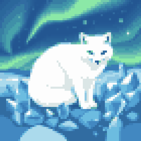
For an animal, the relationship between ears, eyes and muzzle may matter more than individual hairs. For a fruit, the overall shape and color division may matter more than every seed. Simplifying those details is an artistic choice, not an error that must be repaired by increasing resolution. A larger grid creates room for more information, but it also creates more decisions.
6. Check the image at its intended size
Switch regularly between an enlarged working view and the ordinary display size. The enlarged view helps you place cells; the smaller view tells you what the image communicates. If a detail disappears completely, decide whether it needs stronger contrast, a different shape or removal. Do not judge the entire drawing while looking only at a tiny fragment.
When comparing two versions of your own drawing, change one feature at a time. Adjusting the outline, palette and lighting simultaneously makes it difficult to tell which change helped. Save a previous version if your editor supports that workflow, then compare the complete images rather than relying on memory of a few cells.
Use prepared coloring as observation practice
In Pixia, choose a picture from the pixel gallery and notice which color groups define the subject. As the numbered cells fill, inspect how neighboring regions contribute to the whole. This is a way to observe a prepared design. Creating an original image still requires a drawing surface that allows you to place and change pixels freely.
For another grid-based activity, see how to read a cross stitch chart. If you want a short break rather than a drawing exercise, compare visual games for adults. Begin your own pixel artwork with one recognizable shape and a few purposeful colors. The grid becomes easier to use when each cluster has a clear role in the picture.